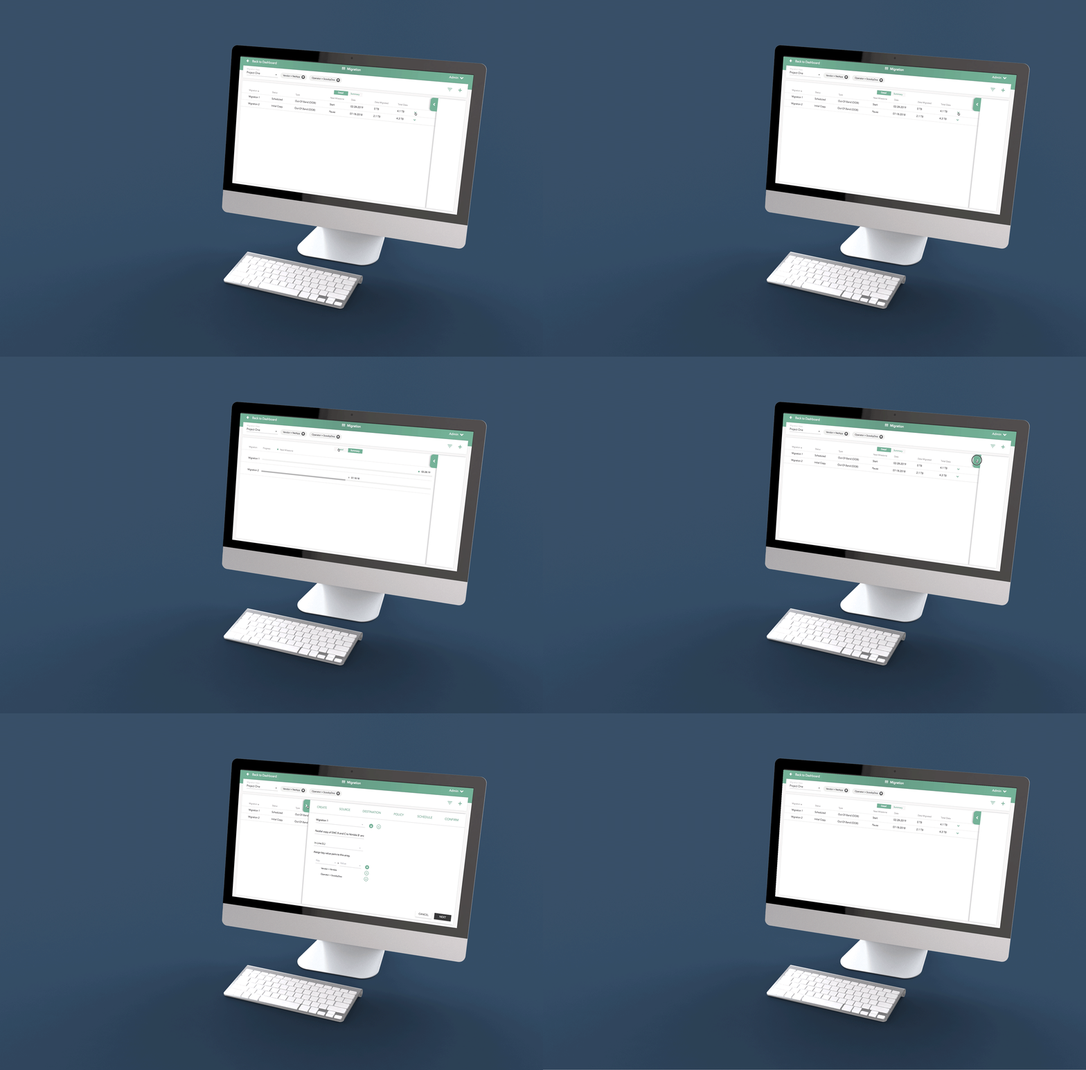
Overview
Parsec customers needed to easily and quickly setup their storage migration appliance. Once online, storage teams need to monitor and manage the Lightspeed's collection of storage migration projects.
We developed a simplified visual language for complex configurations and design patterns that prioritize flexibility and efficiency.
Click the Play button to view a design walk-thru with commentary.
Main Success Scenario
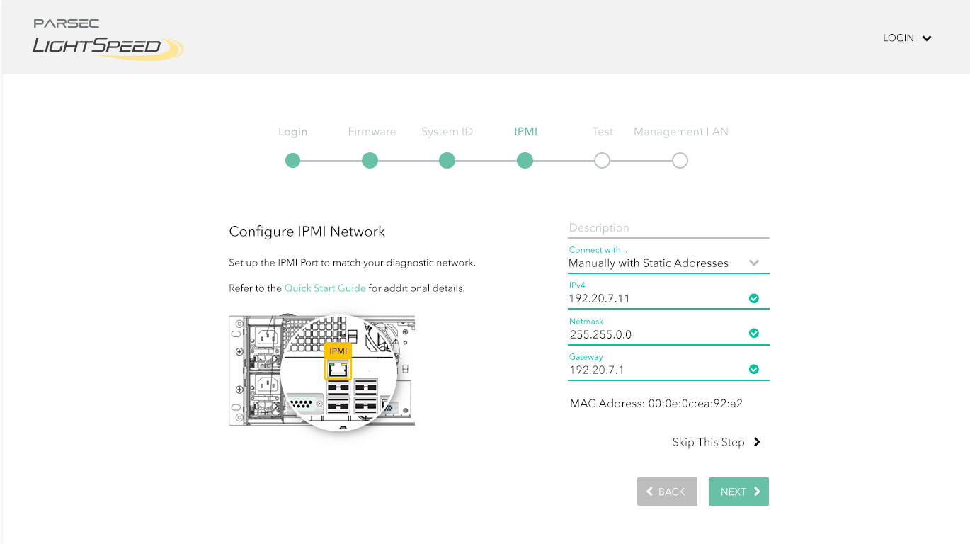
A ‘mini-wizard’ performs minimal setup to robustly connect a light speed appliance to customer’s management network. A dashboard facilitates complex storage migration projects with predictive monitoring.
UX/Design Highlights
We performed the initial user experience research, interviewing field sales engineers, followed with iterative designs, co-developed with product owners.
Our team of seasoned user interface developers built a working set of “Reference Pages” (i.e. working web app) that the client’s own development engineers merged into the device’s embedded system, as features were being developed.
This project demonstrates our deep expertise in storage and networking.
Workflow
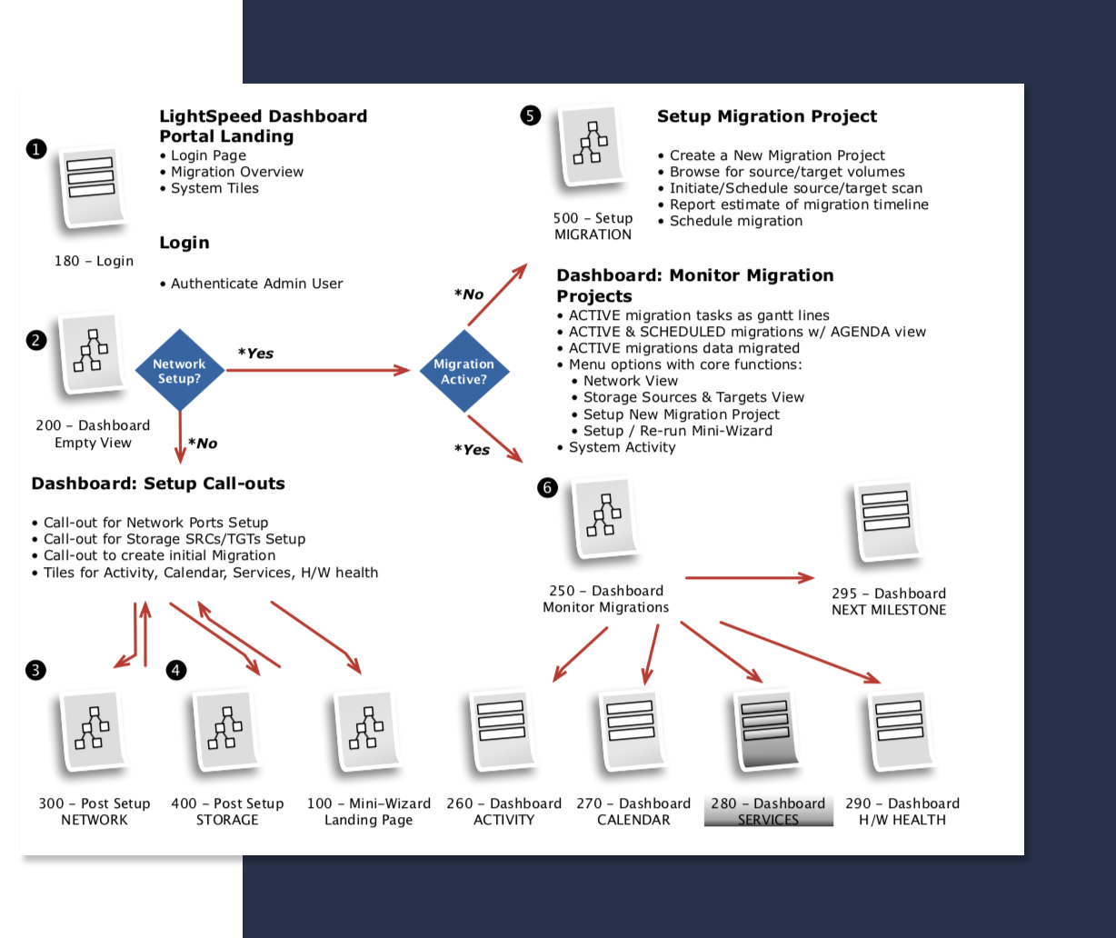
After the initial out-of-box-experience (OOBE), the customer uses the Dashboard for monitoring and on-going configuration tasks.
Our design began with identifying the main success scenario and teasing out the tasks and workflows facilitated through the dashboard.
Dashboard Sketch
Working with a series of photoshop sketches, we began to engage the product owners in a discussion of visual language and design patterns.
Dashboard Storyboard
Following many iterations of a basic layout and workflow, we started refining the corresponding visual language, as shown in this illustration for the Dashboard.
Dashboard Heat Map
We use 3M’s Visual Attention Software to analyze and predict end-user visual attention and scanning order, as they are presented with a user interface; this ensures that the important control surfaces are observed by the user with a casual glance.
Design Pattern Highlights
Onboarding | Complex Configuration | Key Value Tags for Saved Views
Onboarding
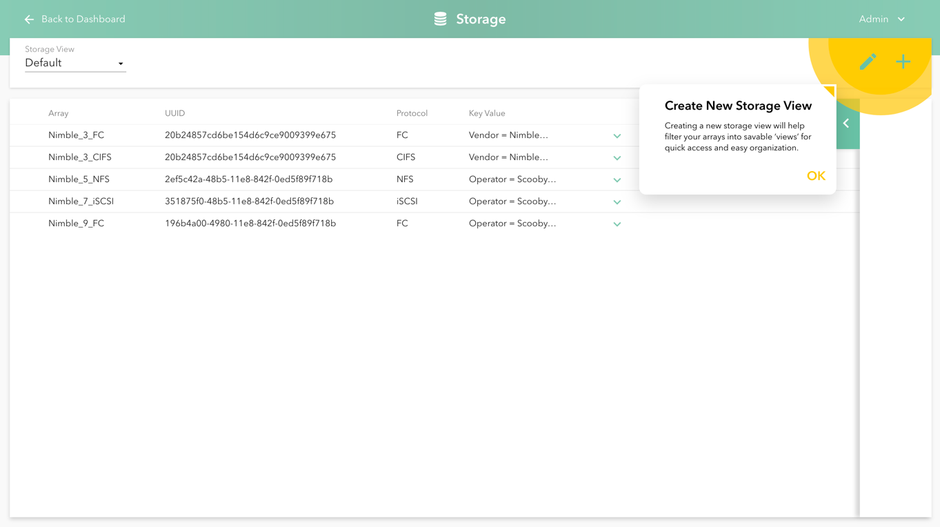
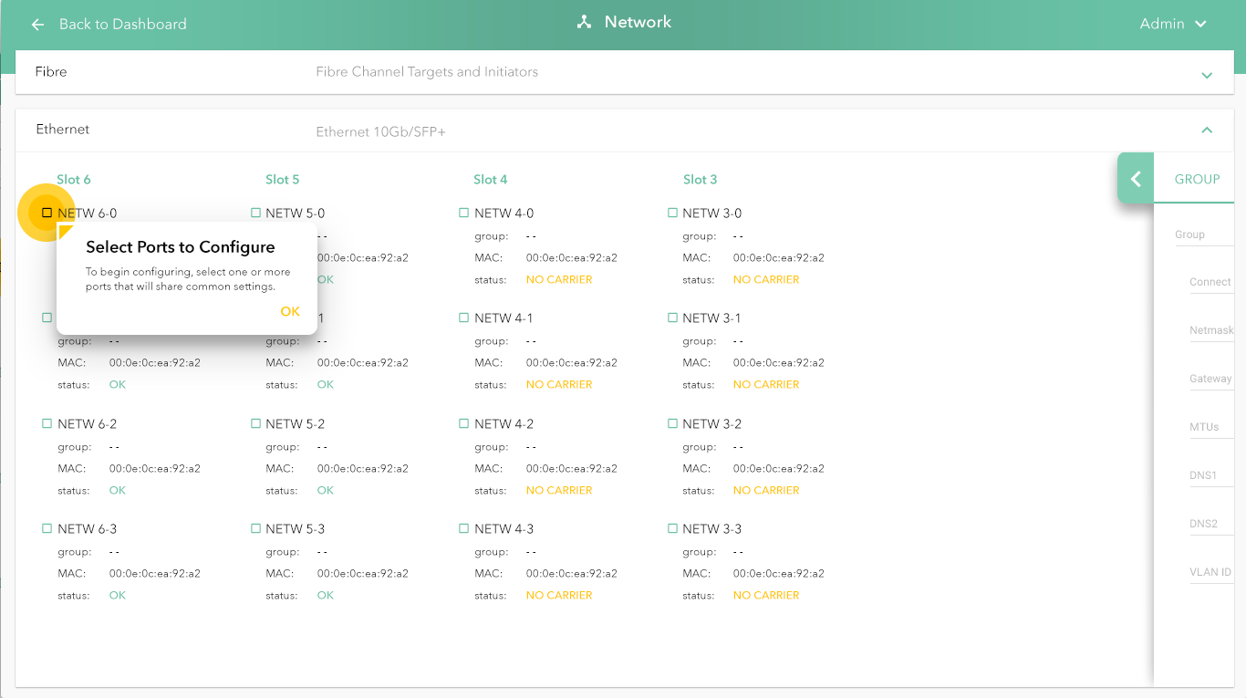
The 'sunburst' tips for first time users walks through the beginning steps of configuration. We use the yellow sunburst as a visual cue to draw attention throughout the app.
Editing a Complex Configuration
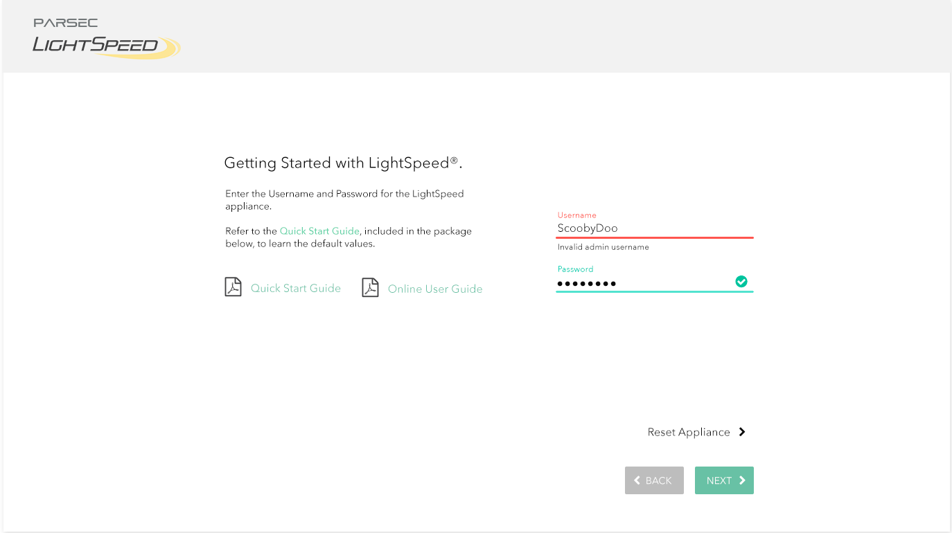
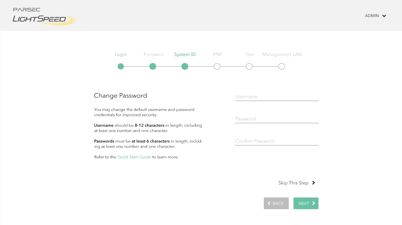
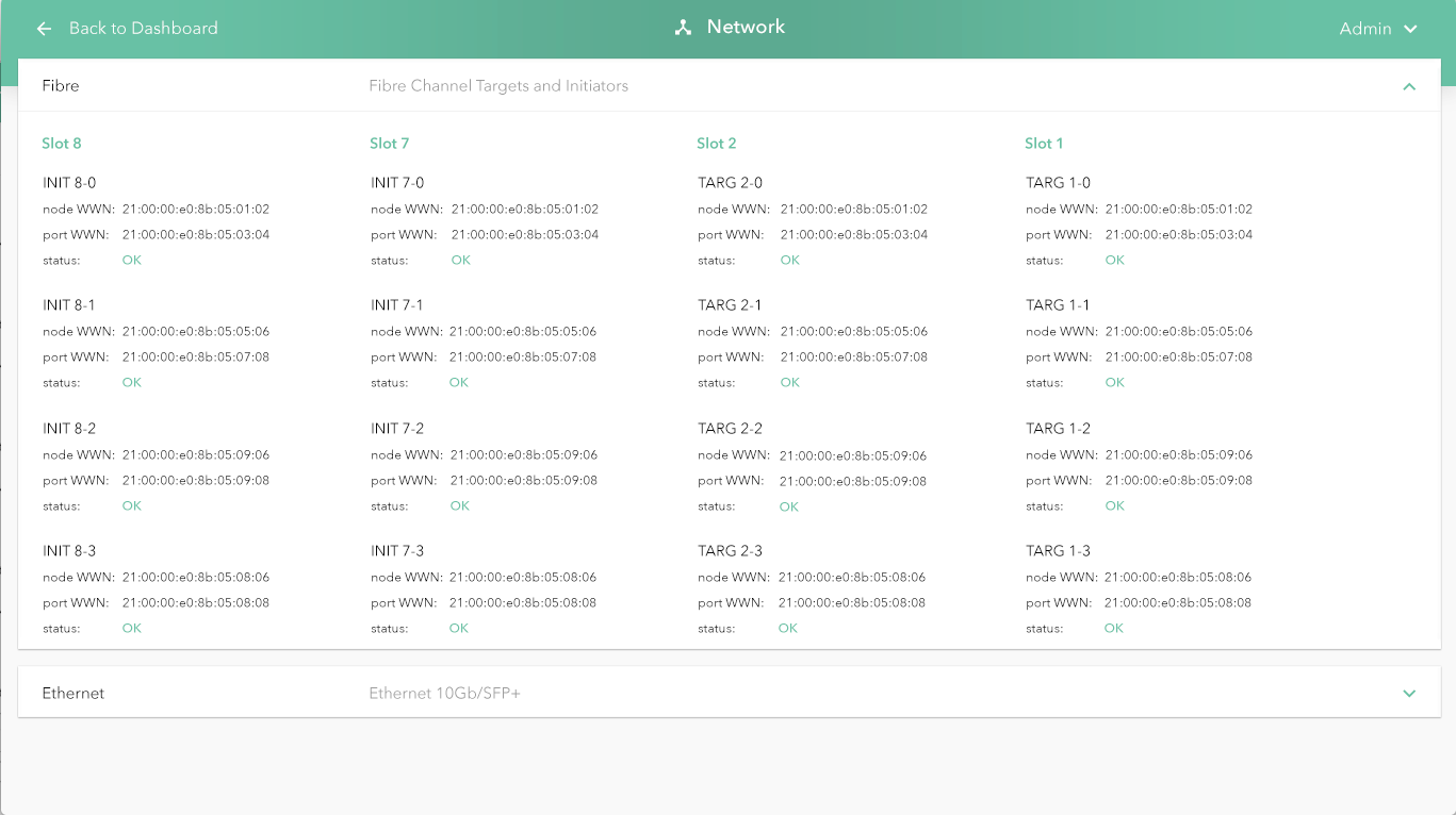
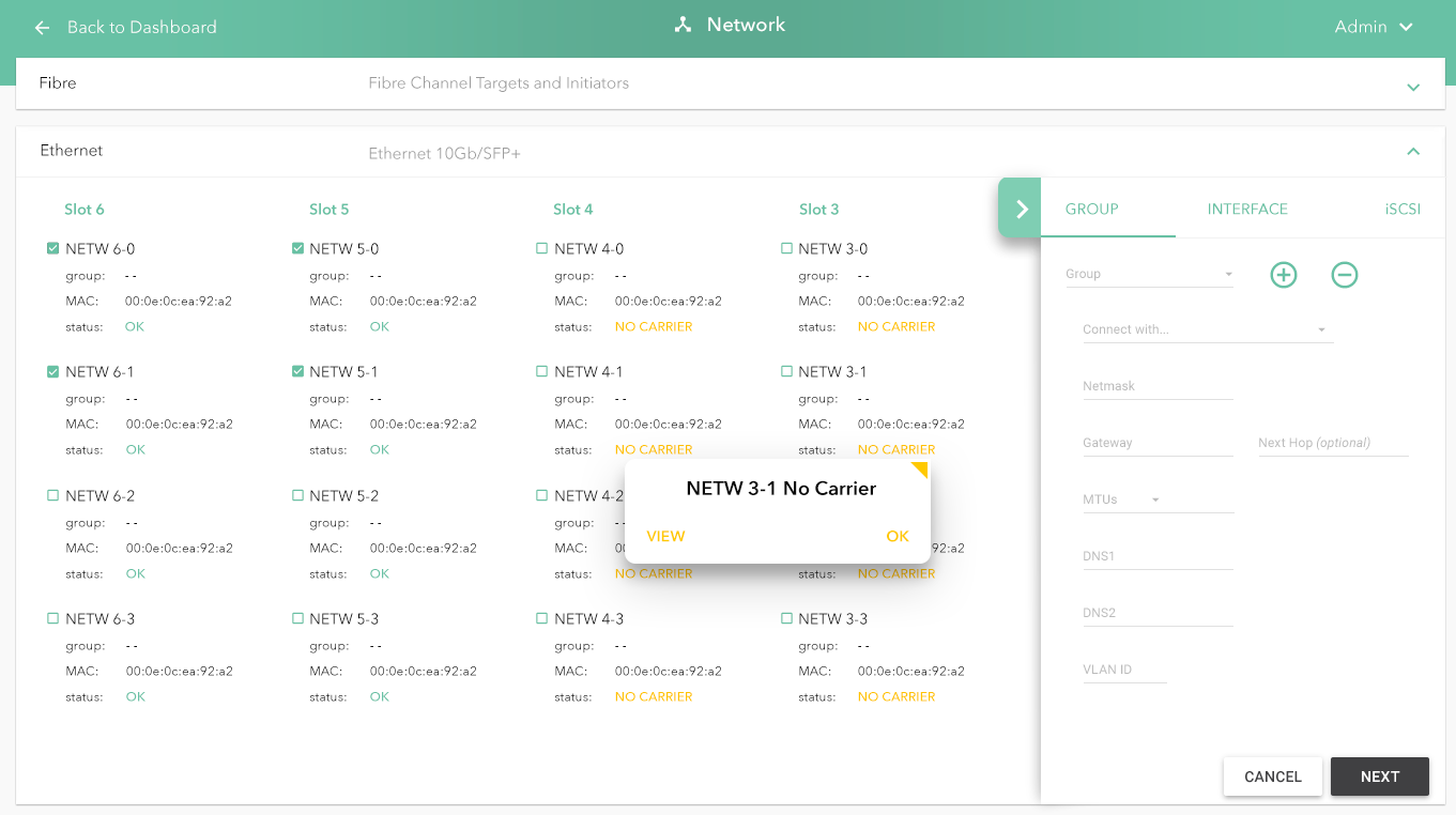
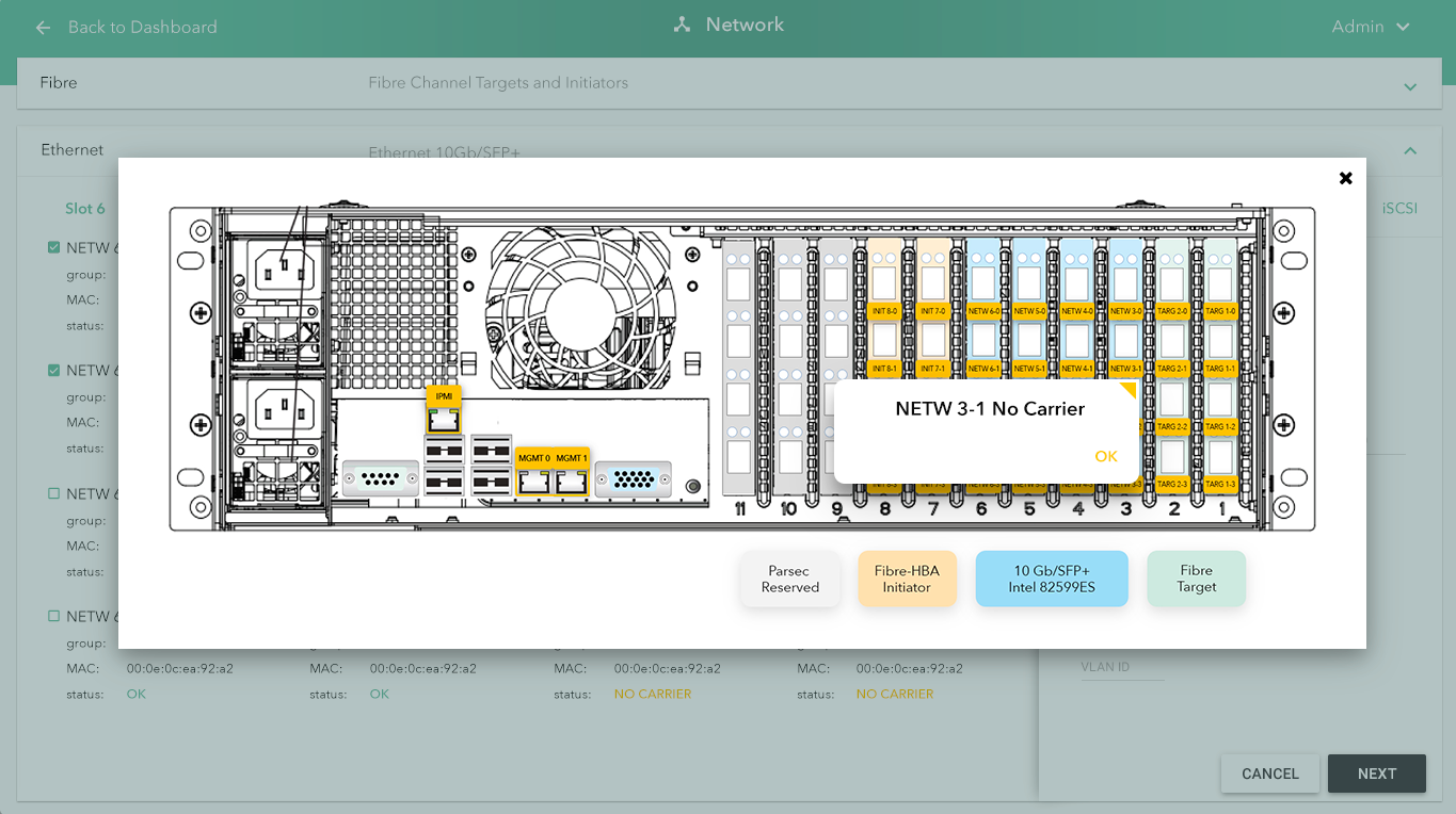
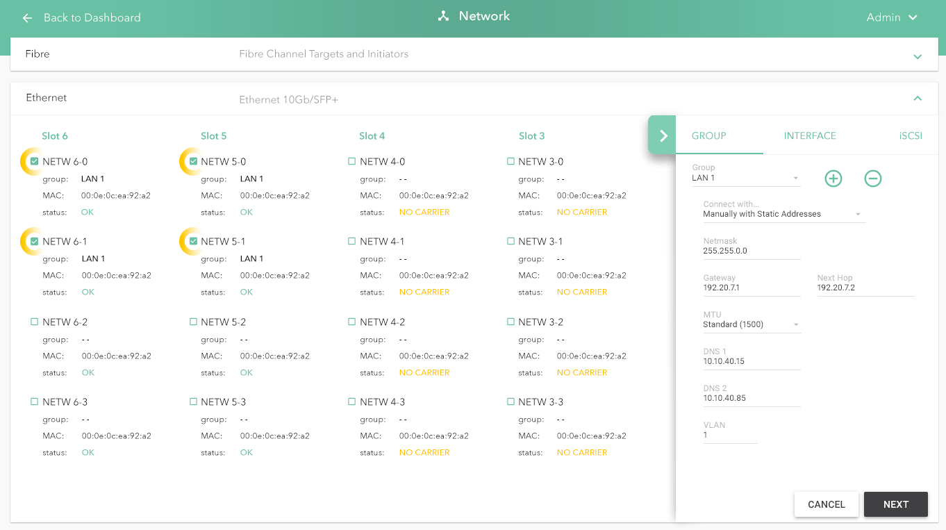
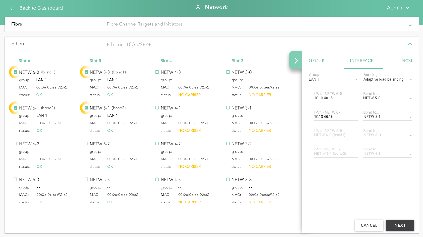
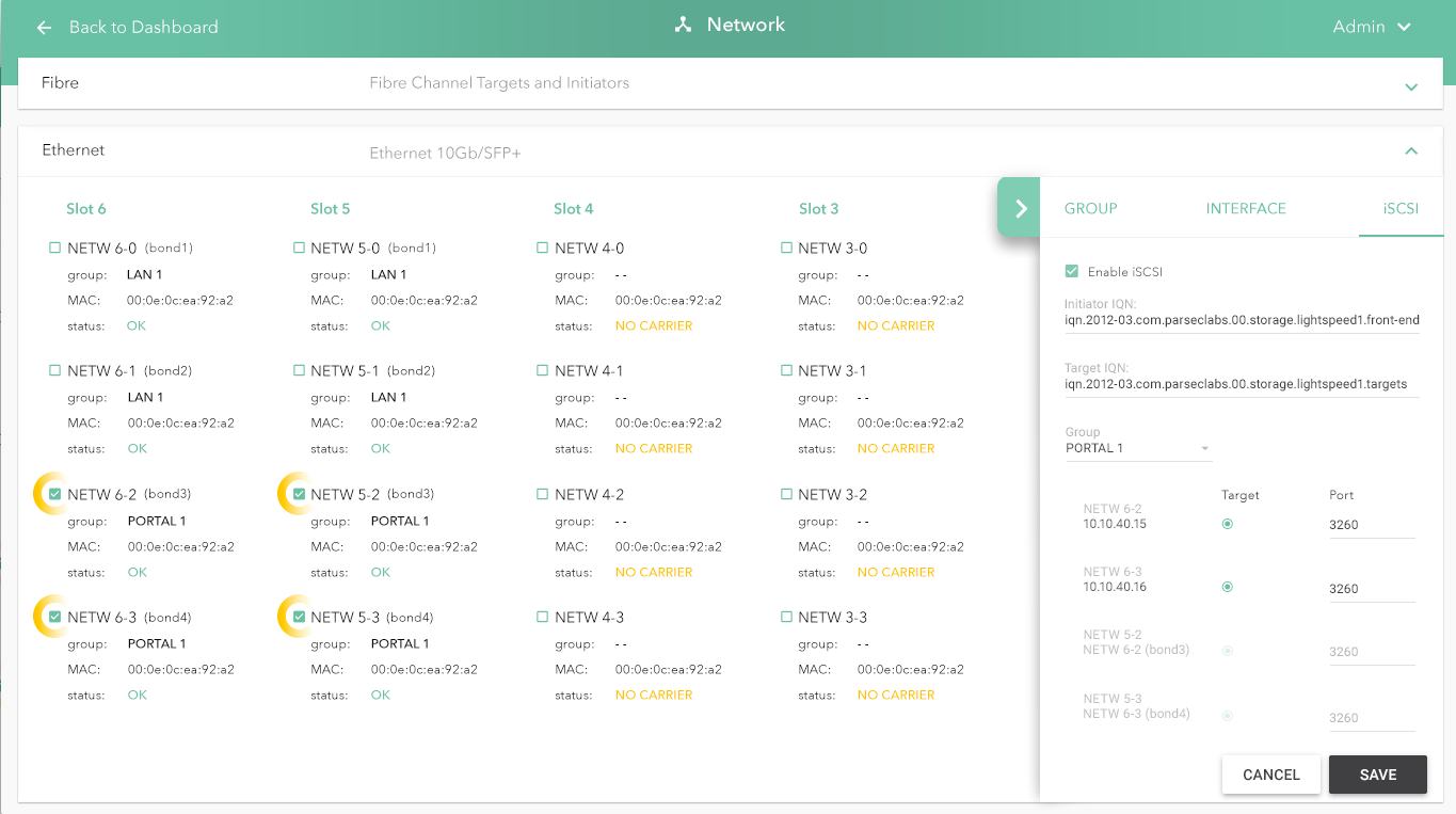
The slideshow demonstrates a variety of visual cues carefully designed to draw attention to device configuration edits, including validation and possible entry errors. Later, we demonstrate a series of "mini-wizard" pages that affect a multi-step process to build a more complex configuration change.
Key Value Tags for Saved Views
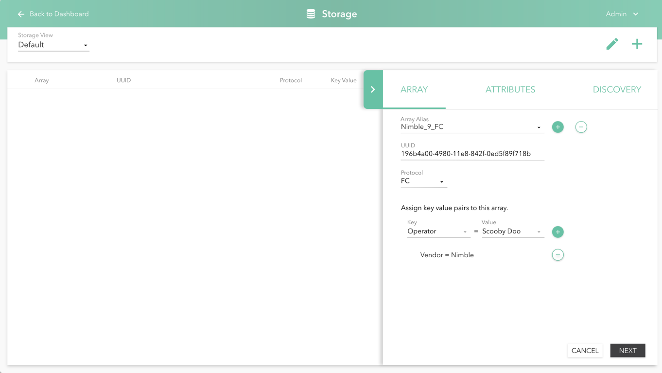
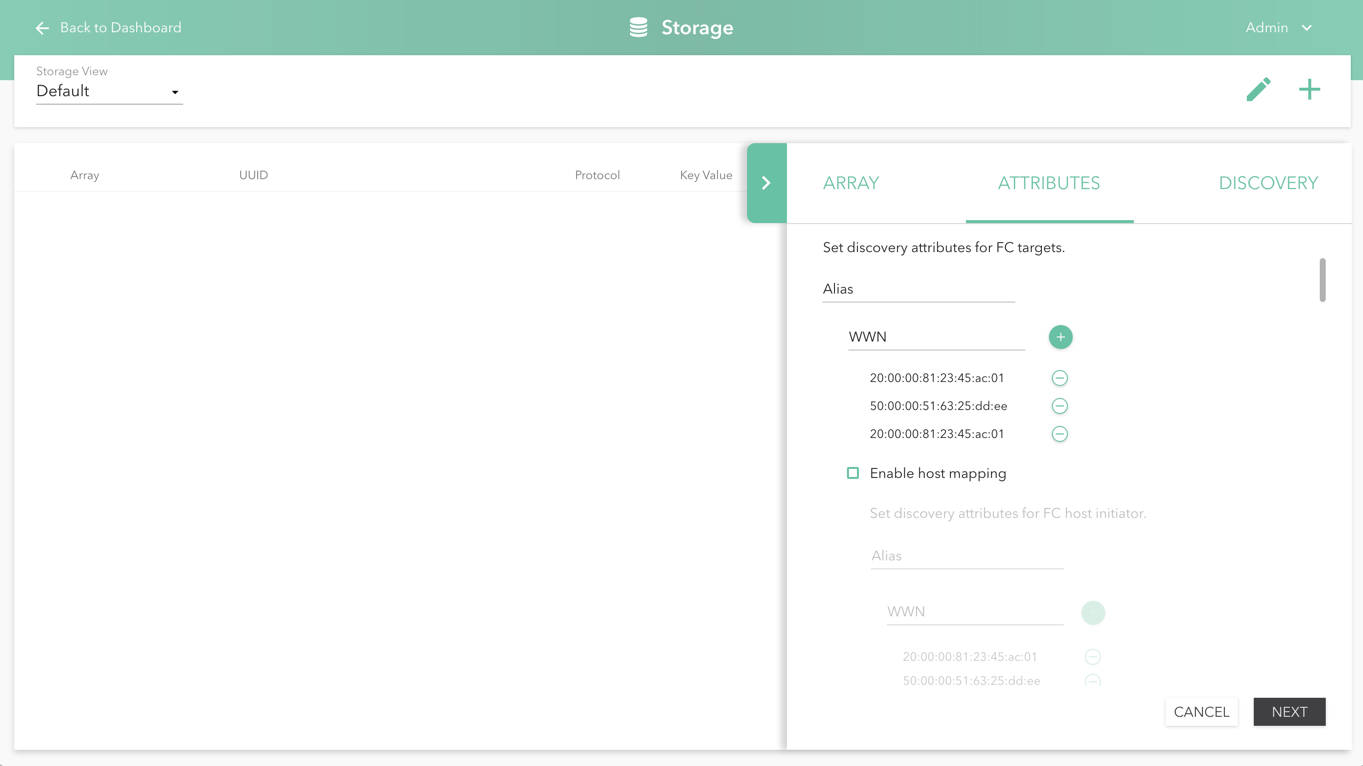
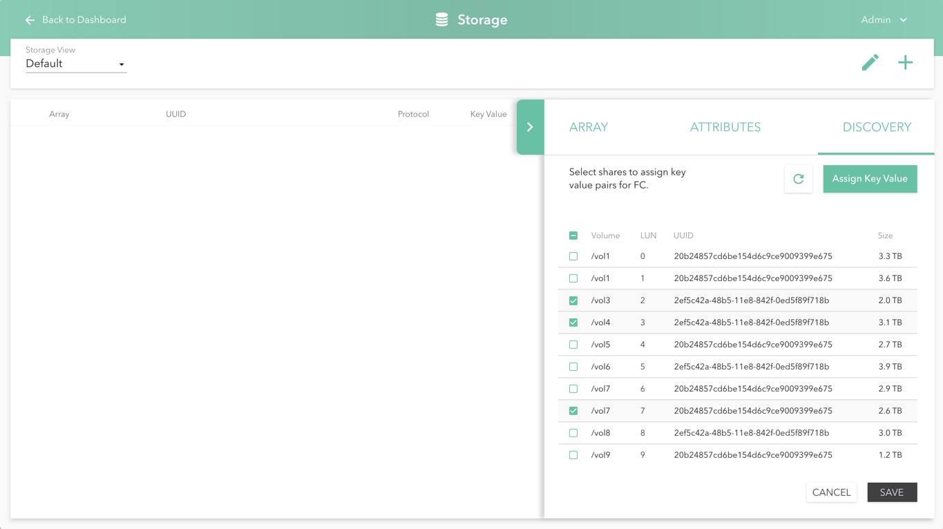
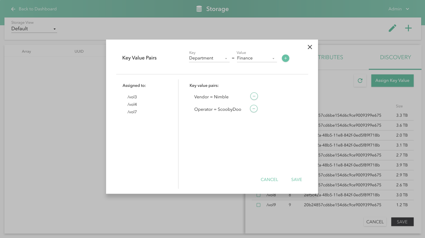
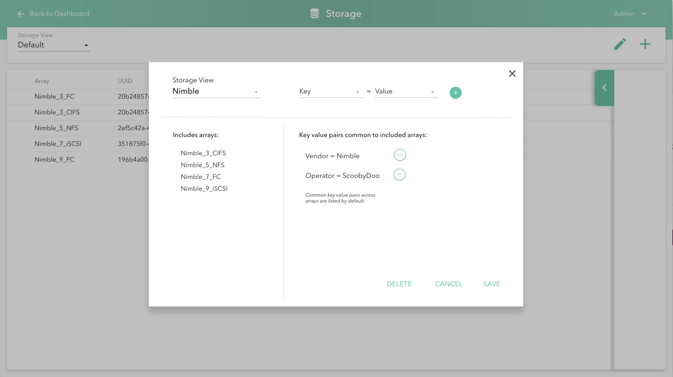
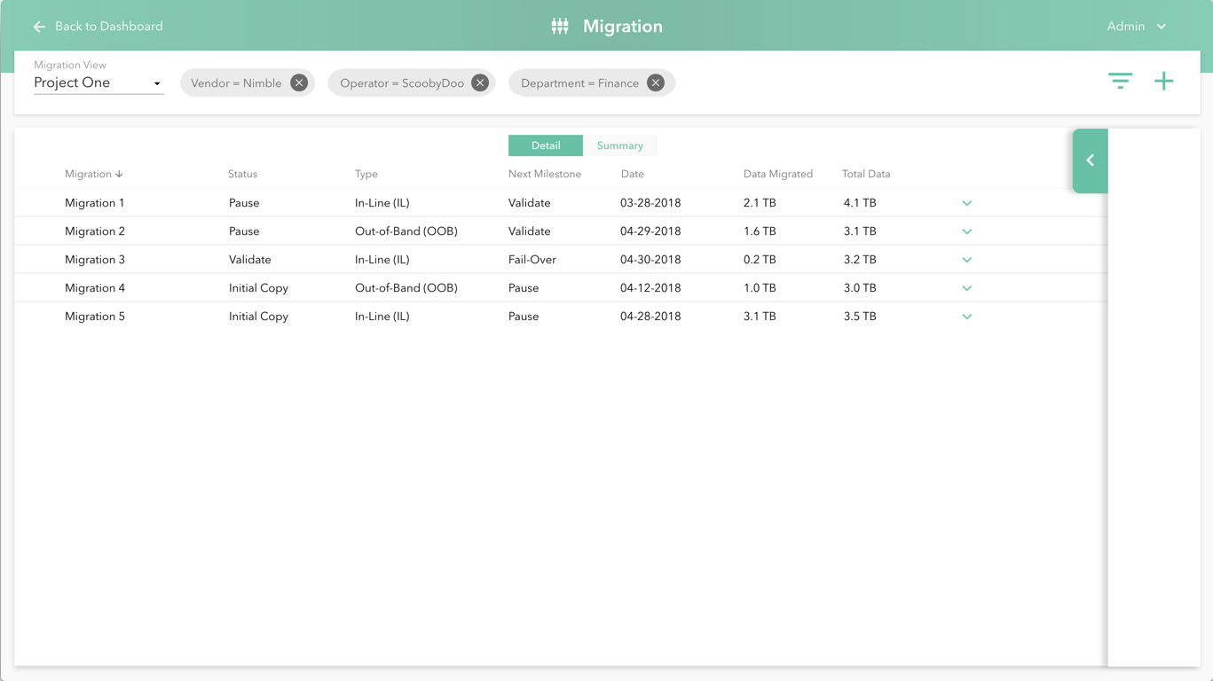
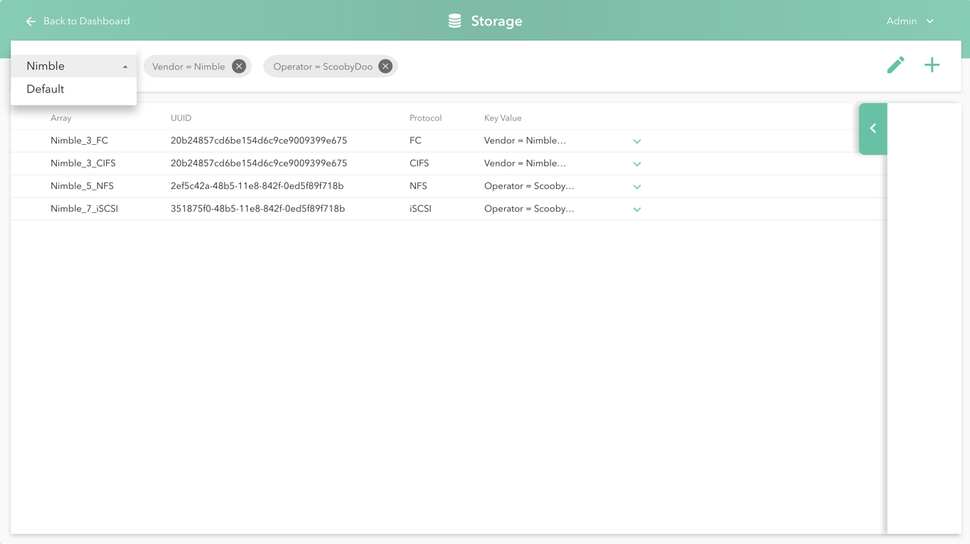
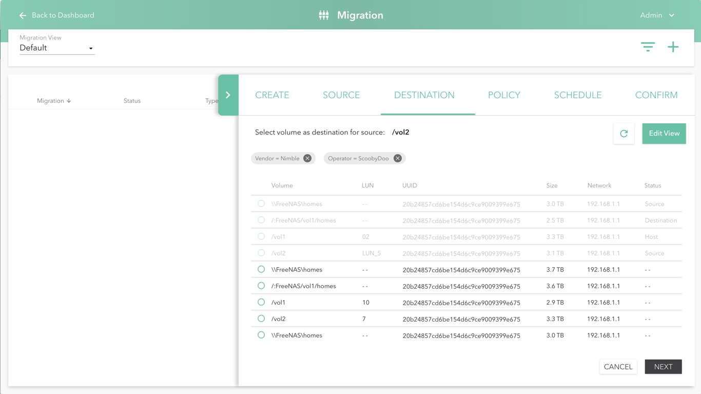
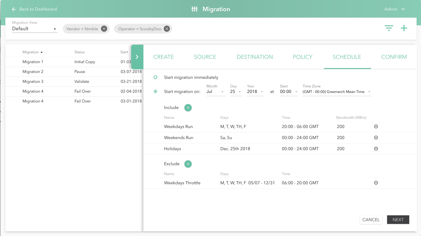
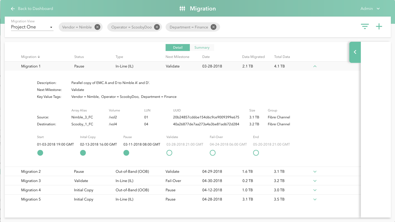
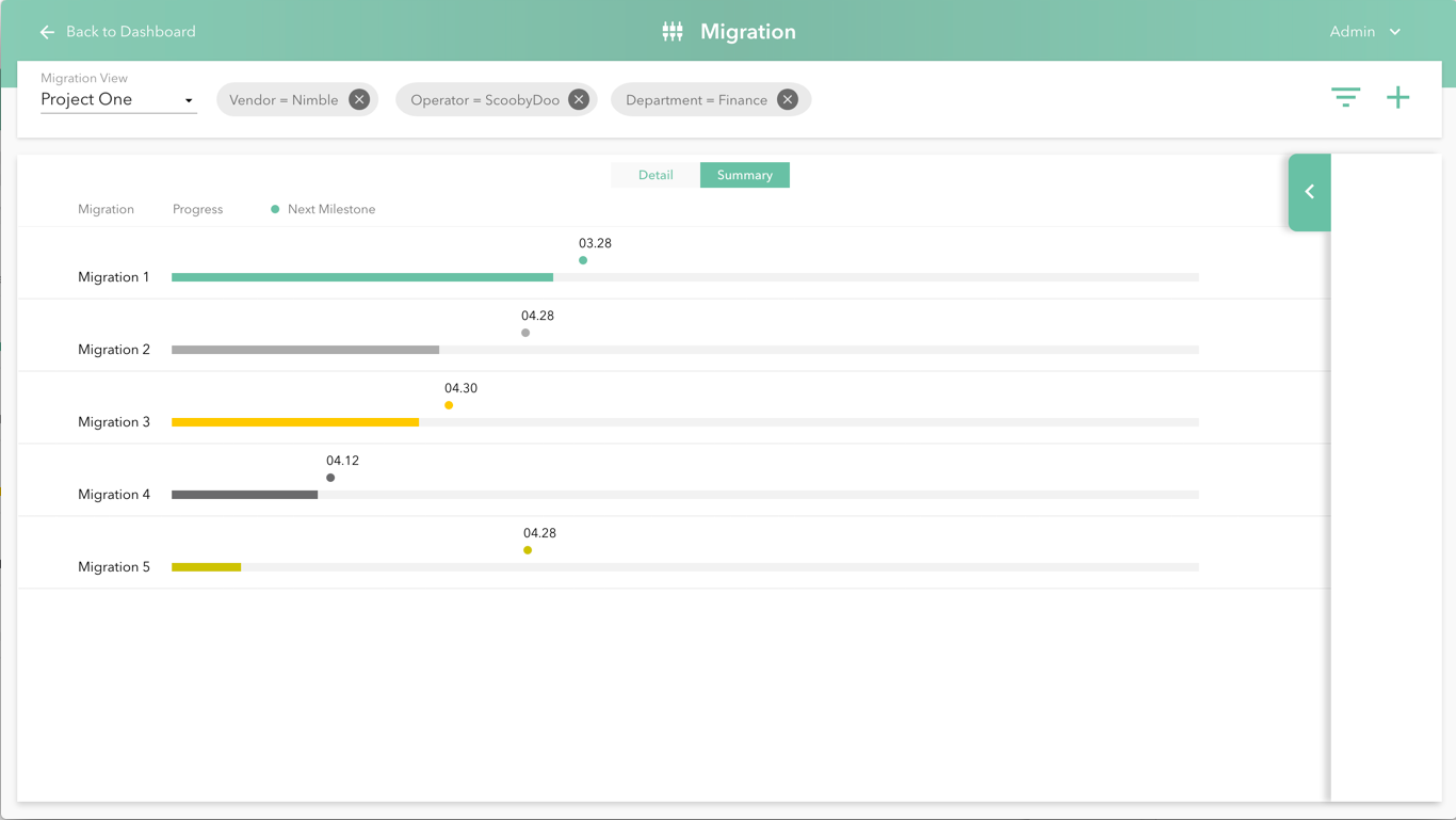
Throughout the configuration progress, we incorporated the assignment of key value tags to ports or migrations. This pattern allows for easy organization and quick access across teams and roles.
